How to Mix and Match Cushion Fabric Patterns Like a Pro
Bringing pattern into your home decor can add a much needed burst of personality into a room, and changing your cushions is a relatively inexpensive way to do this. But mixing patterns is something that doesn’t come naturally to a lot of people. How do you make sure that the patterns look good together? How do you avoid everything looking like a jumble sale with hideous clashes of colour and style?
Worry not. We’re going to dive into the different types of patterns, and then look at how you can put these patterns together like a pro. And if you just want a quick solution, grab the cheatsheet below, which gives you 9 ready-made pattern combinations that you can just copy and use in your own home right away. Download it below and then read on!
So, firstly, let’s have a look at the different types of prints to see what is out there.
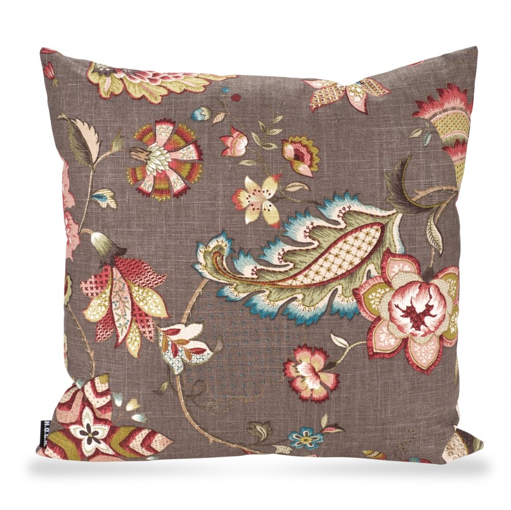
1. PATTERN TYPE: busy/ detailed
Busy, detailed prints are often floral in design, but they can also be images of animals or birds, for example. They are usually (but not always) unsymmetrical, and the patterns are free-flowing, with little structure to them. The pattern almost winds its way across the fabric with no particular destination in mind. They usually combine several colours, which make them a great starting point for pairing with your other fabrics.
Image Sources 1, 2, 3: See below


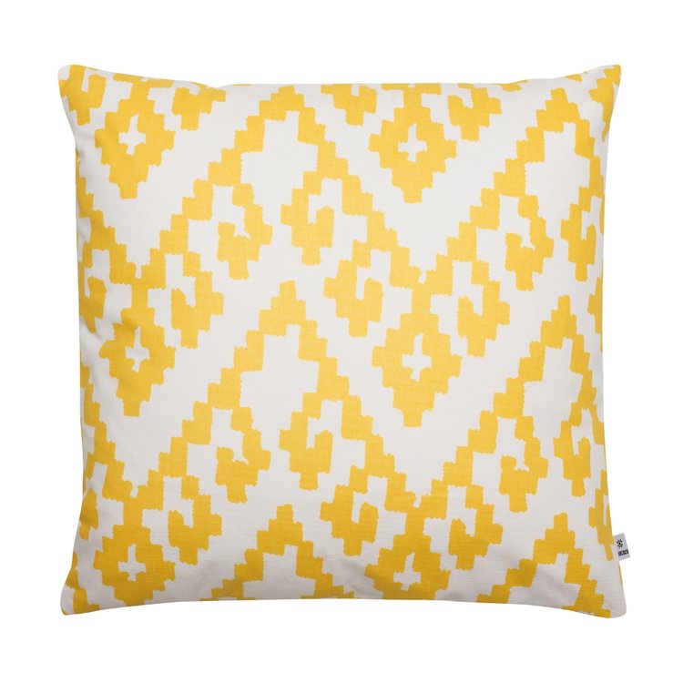
2. PATTERN TYPE: Geometric
Geometric prints are pretty much the polar opposite of busy/detailed prints. They are usually very structured in their design, made up of simple 2D shapes which repeat across the fabric. They can include spots, stripes and checks too. Geometric prints can be inspired by more abstract design styles, such as Bauhaus and Cubism, and they add a modern touch to a scheme. If you are using a heavy floral print, for example, pairing it with a geometric pattern stops the overall look from being too fussy or overly elaborate.
Image Sources 4, 5, 6: See below


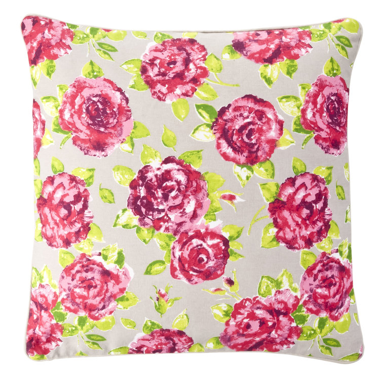
3. Pattern type: Solid Blocks
OK, not strictly a pattern, but adding in some solid blocks of colour helps to break up an otherwise busy scheme. Plain colours can help to anchor a scheme, providing a calming backdrop to a more elaborate design.
Image Sources 7, 8, 9: See below


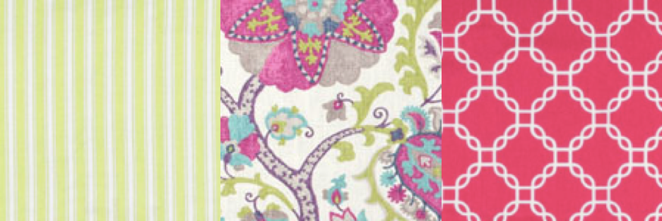
4. Scale
The next thing to consider with patterns is the scale of the actual print. Below are examples of a large scale print (left), a medium scale print (middle) and a small scale print (right). You can see that in the large scale print, only one part of the overall design is showing, whereas on the small scale print, the pattern is repeated over and over.
Image Sources 10, 11, 12: See below


Mixing and Matching
So, now that we know the types of prints available how do we bring it all together? I’m going to share 5 simple rules for mixing and matching patterns.
1. Allow one fabric to be the ‘hero’
Unless you are looking for an outrageous and busy scheme, choose only one very ornate fabric, and ensure that the other fabrics are simple in their design or colour scheme. This allows the main fabric to really shine, and the other patterns act as a backdrop. If you have too many busy fabrics, they will compete for attention.
FABRIC 1 | FABRIC 2 | FABRIC 3
2. Unify your patterns with a consistent colour scheme
Unifying your colours doesn’t mean that all of the colours have to be the same or match, but they do have to look right together. A good rule of thumb is to start with the most busy, detailed fabric, and then repeat two colours from that fabric in your other two fabrics. In the example below, the main fabric is the floral butterfly sample in the middle. The two complementary fabrics echo the purple and green within the main fabric. Make sure that you limit your colour palette to two or three colours though, otherwise the effect can be overpowering.
FABRIC 1 | FABRIC 2 | FABRIC 3
3. Vary your use of BUSY, geometrics and plains
How you mix your fabrics depends largely on the impact you are trying to create. For most traditional schemes, I suggest sticking to one busy/detailed fabric and pairing it against a backdrop of more simple, geometric and plain fabrics so that the busy fabric does not overpower the room. But if you’re looking for a ‘wow’ impact, then go for more busy/detailed patterns together. Just be aware it’s not for everyone!

FABRIC 1 | FABRIC 2 | FABRIC 3
4. Mix your scales carefully
Having all small scale fabrics looks really fussy, and having all large scale patterns means that each pattern fights to be the hero of the piece, leaving you with a visual headache! Allow one large scale print to dominate, and then add in smaller and medium scale patterns too, to complement the main design. In this example below, the floral pattern is large scale, the gingham on the left is small scale and the spotted fabric on the right is medium scale. They all complement each other and don’t compete for attention.
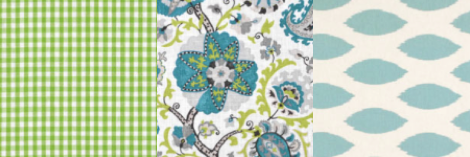
FABRIC 1 | FABRIC 2 | FABRIC 3
5. Use a neutral solid to break up the pattern
Using a solid block gives some relief from the busy activity of more patterned fabrics, and it allows the busy/detailed patterns to take centre stage. In the example below, the balloon and chevron fabrics are grounded by the darker plain fabric. Choose a co-ordinating colour to bring your patterns together.
FABRIC 1 | FABRIC 2 | FABRIC 3
So there you have it. 5 tips for mixing and matching fabrics for your cushions. As with all decorating though, the most important thing is to have fun with it and to experiment a little. So go out there, start mixing and matching using the guidelines above, and see what combinations you come up with. I’d love to see your finished results!
And if you’d rather just have a quick solution, grab the cheatsheet below which gives you 9 different pattern combinations that will work straight off in your home. Enjoy!
Until next time x
-
Main Image, Tropical Collection by Jan Constantine
-
Cushion Images: 1: H.O.C.K Eva, 2: Succulents cushion, The Drifting Bear Co, 3: Vallila Papilio, 4: Geometric prints by Anju Weingandt on DaWanda, 5: Barnaby & Co, 6: Suki McMaster Chess Cushion, 7: And Shine Spira Klutz Light Blue 8: Grey Cotton Cushion, Colours at B&Q, 9: And Shine Spira Klotz Lime Yellow, 10: Vallila Charlotte Floral, Beige, 11: Gift Wrapped Gorgeous Polly Pink, 12: Juniper Jane Textiles, Thistle.
-
With thanks to www.onlinefabricstore.net for the fabric swatch images. They have a truly great range of fabrics so do check them out!


